WCAG 4.1.2 Name, Role, Value Explained in Plain English
WCAG 4.1.2 Name, Role, Value explained simply: give every control a name, role and state with native HTML and ARIA, with code examples and how to test.
Table of contents
4.1.2 Name, Role, Value is the WCAG success criterion that makes sure assistive technology understands every interactive control on your page. A screen reader has to know what a control is called, what kind of control it is and what it is currently set to. Get that wrong, and a “Menu” button is announced as nothing at all. This guide explains WCAG 4.1.2 Name, Role, Value in plain English, with code examples, common failures and how to test your pages.
The official wording (shortened): “For all user interface components, the name and role can be programmatically determined; states, properties, and values that can be set by the user can be programmatically set; and notification of changes to these items is available to user agents, including assistive technologies.” (W3C, WCAG 2.2)
What Is 4.1.2 Name, Role, Value?
4.1.2 Name, Role, Value is a Level A requirement under the Robust principle. It applies to user interface components: links, buttons, form fields, menus, tabs, sliders and any custom widget you build. For each one, three things must be available to assistive technology through the code:
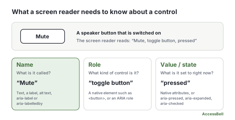
- Name: what the control is called, such as “Search” or “Add to cart”.
- Role: what kind of control it is, such as button, link, checkbox or tab.
- Value and state: what it is set to now, such as checked, expanded, selected or “50%”.
When the state changes, that change must be passed on too. If a menu opens on screen but the code still says “collapsed”, the two no longer match.
For components built with standard HTML, browsers do almost all of this for you. The criterion mostly bites when you build something custom, or when a native control is left without a name.
Why 4.1.2 Name, Role, Value Matters
Sighted people read a control from its look and position. A magnifier icon means search, a box with a tick means checked. Assistive technology cannot see any of that. It reads the code, and if the code says nothing, the control is invisible or meaningless.
Failures of 4.1.2 Name, Role, Value cause real problems:
- A button with no name is announced as just “button”. The person has to guess what it does.
- A clickable div has no role, so it may not be announced as interactive at all, and it usually cannot be reached with the keyboard.
- A custom checkbox that never reports “checked” leaves people unsure whether an option is on.
- A menu that always says “collapsed” hides the fact that it is open.
Who Is Affected by 4.1.2 Name, Role, Value
- People who are blind and use screen readers
- People who use speech recognition, who need a visible name they can say to click a control
- People who use switch devices or the keyboard alone
- Anyone who relies on assistive technology to understand and operate a page
How to Meet 4.1.2 Name, Role, Value
Start with native HTML
The W3C’s first rule of ARIA is to use a native element if one does the job. A real <button> comes with a role, a name from its text, keyboard support and the right states. A <div> styled to look like a button has none of those.
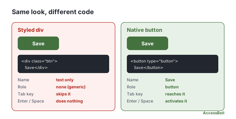
<!-- Fails: no role, no keyboard access -->
<div class="btn" onclick="save()">Save</div>

<!-- Passes: name, role and keyboard support built in -->
<button type="button" onclick="save()">Save</button>
Use <a href> for navigation, <button> for actions, and <input>, <select> and <textarea> for form data. Our guide to keyboard accessibility testing shows how quickly a non-native control fails.
Give every control a name
Every interactive control needs an accessible name. In order of preference:
- Visible text or a visible label:
<button>Save changes</button>, or<label for="email">Email</label>. - Alt text on an image inside the control:
<a href="/"><img src="logo.svg" alt="AccessBell home"></a>. aria-labelledbypointing at existing visible text.aria-labelwhen there is no visible text, such as an icon-only button:
<!-- Fails: icon only, no name -->
<button type="button"><svg aria-hidden="true">...</svg></button>

<!-- Passes -->
<button type="button" aria-label="Close dialog"><svg aria-hidden="true">...</svg></button>
Keep the name in step with the visible text. If a button shows “Search” but its aria-label says “Find”, people using speech recognition who say “click Search” get no result. That is the point of 2.5.3 Label in Name. For form fields, see our guide to 3.3.2 Labels or Instructions.
Set the right role, and only when needed
If you must build a custom widget, give it the ARIA role that matches its behavior, and then add the keyboard behavior that role promises. The W3C’s ARIA Authoring Practices Guide documents the expected keys for every common pattern.
<!-- A custom toggle: role, state, focus and keyboard support are all your job -->
<div role="switch" aria-checked="false" tabindex="0">Dark mode</div>
A role is a promise. role="button" on a div means it must also take focus and respond to Enter and Space. If you cannot keep the promise, use the native element.
Keep states and values in sync
Controls that change need their state exposed and updated. Common attributes:
| Attribute | Used for | Example |
|---|---|---|
aria-expanded |
Menus, accordions, disclosures | aria-expanded="true" when open |
aria-pressed |
Toggle buttons | aria-pressed="true" when on |
aria-checked |
Custom checkboxes and switches | aria-checked="mixed" for partly selected |
aria-selected |
Tabs and options | The current tab |
aria-current |
Current page or step | aria-current="page" |
Native controls update these on their own: a real checkbox tracks checked, and a real <details> tracks whether it is open. For custom widgets, change the attribute in the same code that changes the interface:
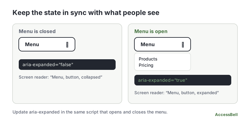
button.addEventListener('click', () => {
  const open = button.getAttribute('aria-expanded') === 'true';
  button.setAttribute('aria-expanded', String(!open));
  menu.hidden = open;
});
Short updates that are not tied to a control, such as “Saved”, fall under 4.1.3 Status Messages instead.
Common failures to watch for
- Icon-only buttons and links with no accessible name
divorspanelements used as buttons or links- Links with no
href, which are not exposed as links or focusable - Form fields with no label
iframeelements with no title- ARIA roles that do not exist, or required ARIA attributes that are missing
aria-expanded,aria-checkedoraria-selectedvalues that never change- Interactive elements nested inside other interactive elements, such as a button inside a link
The W3C publishes the technique list in Understanding 4.1.2 Name, Role, Value, including the failure F59, using script to make div or span elements act as buttons without a role.
How to Test for 4.1.2 Name, Role, Value
Unlike some criteria, a lot of 4.1.2 can be checked automatically. Combine tools with a short manual routine:
- Run an automated scan. An automated checker flags buttons, links and fields with no name, invalid roles and missing ARIA attributes, each with the failing HTML. A free accessibility scan shows how many a page has, and AccessBell Pro lists each one. Our guide to automated vs manual accessibility testing explains what tools can and cannot judge.
- Look at the accessibility tree. Chrome and Firefox both show each element’s computed name, role and state in their developer tools. Check that key controls show the values you expect.
- Tab through the page. Every control should be reachable, show where focus is, and work with Enter or Space.
- Use a screen reader. Listen to a few controls. Each should announce a meaningful name, its role and its state, such as “Menu, button, collapsed”.
- Toggle the states. Open the menu, tick the box, select the tab, and check the announced state changes with it.
Related Success Criteria
- 1.3.1 Info and Relationships: structure and labels are available in the code.
- 2.1.1 Keyboard: everything works from the keyboard.
- 2.5.3 Label in Name: the accessible name contains the visible label.
- 4.1.3 Status Messages: updates are announced without moving focus.
Want to find missing names and roles across your whole site? Run a free WCAG scan of any page, or start a 3-day free trial to monitor up to 500 URLs per domain every day.
Frequently Asked Questions
What level is WCAG 4.1.2 Name, Role, Value?
Level A, the most basic level. It has been part of WCAG since version 2.0, so it applies to every site that aims for WCAG 2.0, 2.1 or 2.2.
Do I need ARIA to meet 4.1.2 Name, Role, Value?
Usually not. Native HTML elements such as button, a, input and select already expose a name, a role and their state to assistive technology. ARIA is for custom widgets that HTML cannot express, and the W3C advice is to use a native element first. Wrong ARIA is worse than none.
What is an accessible name?
The text assistive technology uses to identify a control, such as "Search" or "Close dialog". It comes from a visible label, the text inside the element, an image's alt text, or aria-label and aria-labelledby. Icon-only buttons with no accessible name are one of the most common failures on the web.
Can an automated checker test 4.1.2 Name, Role, Value?
Partly, and better than most criteria. Checkers reliably find buttons and links with no name, form fields with no label, invalid ARIA roles and missing required ARIA attributes. They cannot judge whether a name is meaningful or whether a state, such as expanded, matches what is on screen, so test by hand as well.
How we reviewed this article
- Current version
First published. Checked against the W3C WCAG 2.2 Recommendation, the Understanding document for 4.1.2 Name, Role, Value, WAI-ARIA 1.2 and the W3C guide Using ARIA.