WCAG 1.4.1 Use of Color Explained in Plain English
WCAG 1.4.1 Use of Color explained simply: why color cannot be the only cue, fixes for links, forms, charts and status icons, and how to test your pages.
Table of contents
1.4.1 Use of Color is the WCAG success criterion that says color can never be the only way you show information. A red border on its own does not tell everyone a field has an error. A green dot on its own does not tell everyone a service is online. This guide explains WCAG 1.4.1 Use of Color in plain English, with fixes for links, forms, charts and status indicators, and how to test your pages.
The official wording: “Color is not used as the only visual means of conveying information, indicating an action, prompting a response, or distinguishing a visual element.” (W3C, WCAG 2.2)
What Is 1.4.1 Use of Color?
1.4.1 Use of Color is a Level A requirement under the Perceivable principle, in the guideline “Distinguishable”. It applies whenever color alone carries meaning, for example:
- Conveying information: green for “in stock”, red for “sold out”
- Indicating an action: a link that differs from the surrounding text only by color
- Prompting a response: “Fields in red are required”
- Distinguishing an element: lines on a chart told apart only by color
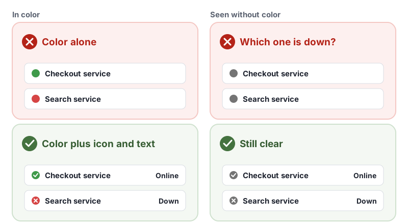
The fix is always the same: keep the color, and add a second cue that does not depend on seeing color, such as text, an icon, a pattern, a shape or an underline.
Why 1.4.1 Use of Color Matters
Not everyone sees color the same way:
- People with color vision deficiency (often called color blindness) may not tell red from green, or blue from yellow.
- People with low vision may see colors faintly, or not at all.
- People who are blind use screen readers, which do not announce colors.
- Some people use high contrast modes or grayscale settings that change or remove colors.
- Anyone reading a printout in black and white, or a screen in bright sunlight, loses subtle color differences.
If meaning lives only in color, all of these people miss it. They cannot tell which field has the error, which link to click or which line on a chart is which.
Who Is Affected by 1.4.1 Use of Color
- People with color vision deficiency
- People with low vision
- People who are blind and use screen readers
- Older adults, whose color perception can change with age
- People using high contrast or grayscale display settings
How to Meet 1.4.1 Use of Color
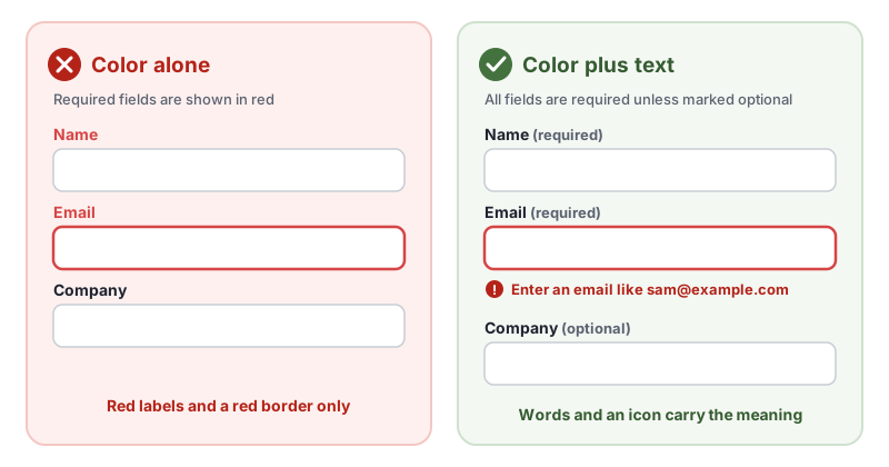
Mark required fields and errors with text
Saying “fields in red are required”, or showing an error only with a red border, fails 1.4.1 Use of Color. The W3C lists this as failure F81, identifying required or error fields using color differences only.
<label for="email">Email <span class="hint">(required)</span></label>
<input id="email" name="email" type="email" required aria-invalid="true" aria-describedby="email-error">
<p id="email-error" class="field-error">
  <svg aria-hidden="true" focusable="false"><!-- alert icon --></svg>
  Enter an email like sam@example.com
</p>
This follows the W3C technique G14, ensuring that information conveyed by color differences is also available in text. Clear error text also helps meet 3.3.1 Error Identification.
Underline links in body text
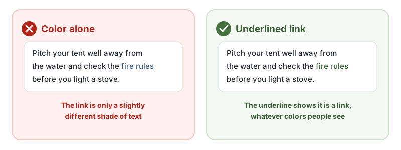
A link inside a paragraph that differs from the text around it only by color fails 1.4.1 Use of Color. The W3C lists this as failure F73, creating links that are not visually evident without color vision.
/* Keep underlines on links in running text */
.prose a {
  text-decoration: underline;
  text-underline-offset: 0.2em;
}
If your design removes underlines, the W3C technique G183, using a 3:1 contrast ratio with surrounding text plus a visual cue on hover and focus describes the alternative: the link color needs a contrast ratio of at least 3:1 with the surrounding text, and the link needs a non-color cue, such as an underline, on hover and keyboard focus. Check both colors with our free WCAG color contrast checker. Navigation menus and buttons, where it is obvious everything is a link, do not need underlines.
Add patterns and labels to charts
Charts and maps that tell lines, bars or areas apart only by color fail for many readers. Add a second cue:
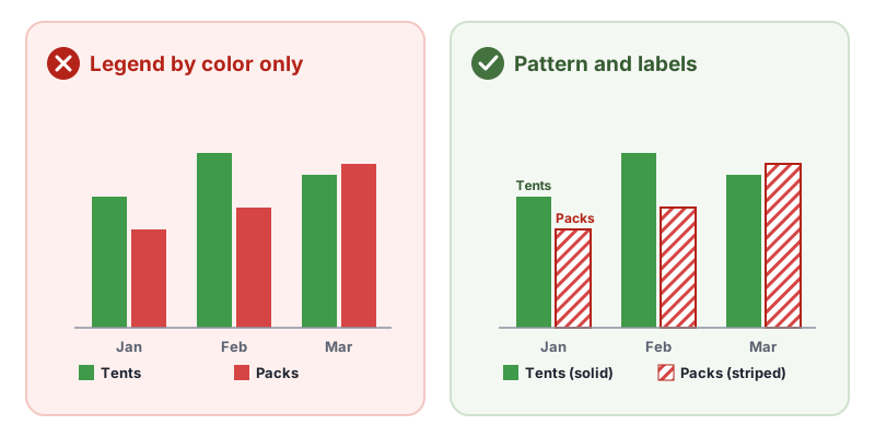
- Use patterns or textures, such as solid and striped fills. This is the W3C technique G111, using color and pattern.
- Use different marker shapes on line charts, such as circles, squares and triangles.
- Label data directly on the chart, rather than relying only on a color legend.
- Test your palette with our free chart color checker, which shows how the colors look with color blindness.
- Offer the data as a table as well, which also helps meet 1.1.1 Non-text Content.
Pair status colors with icons and words
Green, amber and red status dots, colored badges and color-coded calendar events all need a second cue. Add an icon (a check, a warning triangle, a cross) and a word (“Online”, “Delayed”, “Down”). For text that is highlighted by color, such as a changed price, the W3C technique G182, adding a visual cue when text color differences convey information recommends an extra visual cue, such as bold text or an icon.
How to Test for 1.4.1 Use of Color
Automated tools can check one case: axe-core’s link-in-text-block rule looks for links that differ from surrounding text only by color. Most other color-only problems need a person. In our test of 10 accessibility checker tools, none of the ten reported a form that marked required fields only in red as an error, and only one flagged it for manual review. Test by hand:
- View the page in grayscale. Most operating systems have a grayscale color filter in their accessibility settings. Browser developer tools can also emulate vision deficiencies.
- Look for meaning that disappears: required fields, errors, links, chart series, status indicators, selected tabs and calendar events.
- Read the instructions. Any instruction like “click the green button” or “fields in red are required” fails.
- Check links in paragraphs. Can you tell they are links without color?
- Check each fix gives the same information in text, an icon, a pattern or an underline.
For a quick reference, see our 1.4.1 Use of Color page in the WCAG library, and the W3C’s Understanding 1.4.1 Use of Color.
Related Success Criteria
- 1.4.3 Contrast (Minimum): text has enough contrast with its background.
- 1.4.11 Non-text Contrast: icons, borders and chart parts have enough contrast.
- 1.3.3 Sensory Characteristics: instructions do not rely only on shape, color, size or position.
Want to find color-only links and low-contrast text automatically? Run a free WCAG scan of any page, then check the rest by hand in grayscale.
Frequently Asked Questions
What level is WCAG 1.4.1 Use of Color?
Level A, the most basic level. It has been part of WCAG since version 2.0, so it applies to every site that aims for WCAG 2.0, 2.1 or 2.2.
Does 1.4.1 Use of Color mean I cannot use color?
No. Color is encouraged. 1.4.1 Use of Color only says color cannot be the only way information is shown. Keep your colors and add a second cue, such as text, an icon, a pattern or an underline.
Do links have to be underlined to meet 1.4.1?
Underlining links in body text is the simplest way to meet 1.4.1 Use of Color. If you remove the underline, the link color needs a contrast ratio of at least 3:1 with the surrounding text, plus a non-color cue, such as an underline, when the link is hovered or focused.
What is the difference between 1.4.1 Use of Color and 1.4.3 Contrast?
1.4.1 Use of Color is about whether color is the only cue. 1.4.3 Contrast (Minimum) is about whether text is dark or light enough against its background to read. A page can pass one and fail the other.
How we reviewed this article
- Current version
First published. Checked against the W3C WCAG 2.2 Recommendation and the Understanding document for 1.4.1 Use of Color.