WCAG 1.4.3 Contrast (Minimum) Explained in Plain English
WCAG 1.4.3 Contrast (Minimum) explained simply: the 4.5:1 and 3:1 ratios, what counts as large text, the exceptions, fixes and how to test your colors.
Table of contents
1.4.3 Contrast (Minimum) is the WCAG success criterion that makes sure text stands out clearly from its background. Normal text needs a contrast ratio of at least 4.5:1, and large text at least 3:1. Light gray text on white, white text on a pale photo and faint placeholder text are among the most common accessibility failures on the web. This guide explains WCAG 1.4.3 Contrast (Minimum) in plain English: the ratios, what counts as large text, the exceptions, how to fix low contrast and how to test your colors.
The official wording: “The visual presentation of text and images of text has a contrast ratio of at least 4.5:1”, except that large text needs at least 3:1, and incidental text and logotypes have no contrast requirement. (W3C, WCAG 2.2)
What Is 1.4.3 Contrast (Minimum)?
1.4.3 Contrast (Minimum) is a Level AA requirement under the Perceivable principle, in the guideline “Distinguishable”. It applies to text and images of text, and compares the brightness of the text color with the brightness of the background behind it.
The contrast ratio runs from 1:1 (no difference, such as white on white) to 21:1 (black on white). WCAG sets two minimums:
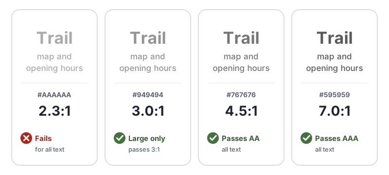
- 4.5:1 for normal text, such as body copy, links, labels and buttons
- 3:1 for large text
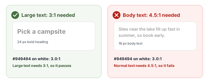
Large text means at least 18 point, which is about 24 CSS pixels, or at least 14 point bold, which is about 18.66 CSS pixels in bold. Most body text at 16 pixels is normal text and needs 4.5:1.
Why 1.4.3 Contrast (Minimum) Matters
Low contrast makes text hard or impossible to read for many people:
- People with low vision often see less contrast than others, so faint text fades into the background.
- People with color vision deficiency may see some color pairs as much closer in brightness than they look to others.
- Older adults commonly need more contrast as their eyes age.
- Everyone struggles with low-contrast text on a phone in bright sunlight or on a dim, low-quality screen.
The 4.5:1 minimum is set so text stays readable for people with moderately low vision, without them needing to use assistive technology.
Who Is Affected by 1.4.3 Contrast (Minimum)
- People with low vision
- People with color vision deficiency
- Older adults
- People with some cognitive or reading disabilities, who find low-contrast text tiring
- Anyone reading in glare, on a small screen or on a poor display
How to Meet 1.4.3 Contrast (Minimum)
Pick text and background colors that pass
Check every text color against the background it sits on, and adjust until it passes. This is the W3C technique G18, ensuring a contrast ratio of at least 4.5:1, and G145 for 3:1 on large text. Our free WCAG color contrast checker calculates the ratio for any pair of colors and tells you which levels it passes.
Build the passing colors into your design system, so every page uses them:
:root {
  --text: #1f2430;        /* body text, far above 4.5:1 on white */
  --text-muted: #595959;  /* secondary text, 7.0:1 on white */
  --link: #2c5f2d;        /* check each brand color before use */
}
Common problem spots to check:
- Light gray body text, captions and footer text
- Placeholder text in form fields
- Text on colored buttons and badges, especially white text on light brand colors
- Links, including their hover and focus states
- Text on top of images and gradients
Always set the background with the text color
If you set a text color but leave the background to the browser, someone whose default background is dark can end up with dark text on dark. The W3C lists this as failure F24, specifying foreground colors without specifying background colors. Set both together on the same element or a parent.
Make text on images readable
Text over a photo or video is only as readable as the lightest or darkest part behind it. The W3C lists low contrast from a background image as failure F83.
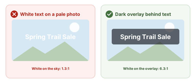
/* A dark overlay under white hero text */
.hero {
  background: linear-gradient(rgba(20, 24, 32, 0.65), rgba(20, 24, 32, 0.65)), url('hero.jpg') center / cover;
  color: #fff;
}
Check the contrast against the lightest part of the image behind the text, not an average.
Know what is exempt
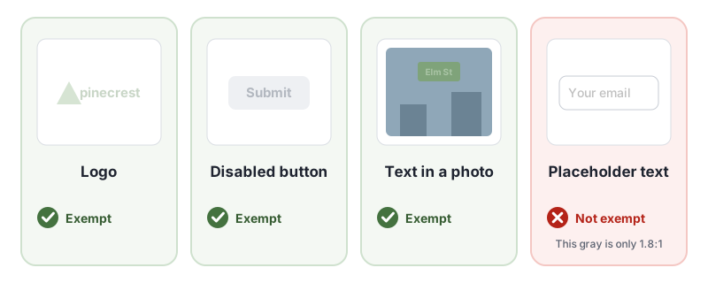
1.4.3 Contrast (Minimum) does not apply to:
- Logotypes: text that is part of a logo or brand name.
- Inactive controls: text on a disabled button or field.
- Decoration: text that is purely decorative or not visible to anyone.
- Text in pictures: text that is part of a picture with other significant visual content, such as a sign in a street photo.
Contrast for icons, form field borders and chart elements is covered separately by 1.4.11 Non-text Contrast, which asks for 3:1.
How to Test for 1.4.3 Contrast (Minimum)
Contrast on plain backgrounds is one of the easiest things for software to find. In our test of 10 accessibility checker tools, 9 of the 10 caught light gray text with a 2.3:1 ratio. Text on images is harder: none of the tools reported white text over a light background photo as an error, though 7, including AccessBell, flagged it for a manual check. Test in two steps:
- Run an automated scan to find low-contrast text on solid backgrounds. Run a free WCAG scan of any page to start.
- Check what tools cannot measure: text on images, gradients and videos, text that appears on hover or focus, and text in images.
- Measure any pair by hand with an eyedropper tool and our WCAG color contrast checker.
- Check every state: hover, focus, visited, selected and error states often use different colors.
- Check the whole template: navigation, footers, cookie banners and pop-ups are easy to miss.
For a quick reference, see our 1.4.3 Contrast (Minimum) page in the WCAG library, and the W3C’s Understanding 1.4.3 Contrast (Minimum).
Related Success Criteria
- 1.4.6 Contrast (Enhanced): the Level AAA version, at 7:1 for normal text and 4.5:1 for large text.
- 1.4.11 Non-text Contrast: icons, controls and graphics need 3:1.
- 1.4.1 Use of Color: color is never the only way information is shown.
- 1.4.8 Visual Presentation: people can choose their own text and background colors.
Want to find low-contrast text across a page in seconds? Run a free WCAG scan, then check text on images by hand.
Frequently Asked Questions
What level is WCAG 1.4.3 Contrast (Minimum)?
Level AA. It has been part of WCAG since version 2.0, so it applies to every site that aims for WCAG 2.0, 2.1 or 2.2 Level AA, the level most accessibility laws point to.
What contrast ratio does 1.4.3 Contrast (Minimum) require?
At least 4.5:1 for normal text and 3:1 for large text. Large text means at least 18 point (about 24 CSS pixels), or at least 14 point bold (about 18.66 CSS pixels bold).
Does placeholder text need to meet 1.4.3?
Yes. Placeholder text is text people need to read, so it needs a contrast ratio of at least 4.5:1 against the field background. Many default placeholder styles are lighter than that.
Do logos and disabled buttons need good contrast?
No. Text in a logo or brand name, text on inactive (disabled) controls, purely decorative text and text that is part of a picture with other significant content have no contrast requirement under 1.4.3 Contrast (Minimum).
How we reviewed this article
- Current version
First published. Checked against the W3C WCAG 2.2 Recommendation and the Understanding document for 1.4.3 Contrast (Minimum).