WCAG 1.4.8 Visual Presentation Explained in Plain English
WCAG 1.4.8 Visual Presentation explained simply: the five rules for readable blocks of text, who they help, the CSS to meet them and how to test your pages.
Table of contents
1.4.8 Visual Presentation is the WCAG success criterion about making long passages of text comfortable to read. It covers five things: people can choose their own text and background colors, lines are not too long, text is not justified, lines and paragraphs are well spaced, and text can be enlarged to 200% without scrolling sideways. This guide explains WCAG 1.4.8 Visual Presentation in plain English, with the CSS to meet each rule.
The official wording: “For the visual presentation of blocks of text, a mechanism is available to achieve the following”, followed by five requirements for colors, width, alignment, spacing and resizing. (W3C, WCAG 2.2)
What Is 1.4.8 Visual Presentation?
1.4.8 Visual Presentation is a Level AAA requirement under the Perceivable principle. It applies to blocks of text: more than one sentence of running text, like the paragraphs of an article or a policy page. For those blocks, people need to be able to get:
- Their own colors. Foreground and background colors can be chosen by the reader.
- A comfortable line length. No more than 80 characters per line, or 40 for Chinese, Japanese and Korean text.
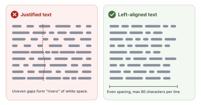
- No justified text. Text is not stretched to line up with both the left and right margins.
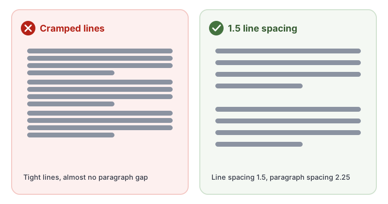
- Enough spacing. Line spacing of at least 1.5, and paragraph spacing at least 1.5 times the line spacing.
- Room to grow. Text can be resized to 200% without needing to scroll horizontally to read a line, in a full-screen window.
Why 1.4.8 Visual Presentation Matters
Long, dense text is tiring for everyone. For some readers it is the difference between understanding a page and giving up:
- People with dyslexia and other reading disabilities lose their place more easily in long lines and tightly packed text.
- Justified text creates uneven gaps between words that can line up into distracting “rivers” of white space.
- People with low vision enlarge text, and if the layout does not reflow, they must scroll sideways for every single line.
- Some people with dyslexia, Irlen syndrome or light sensitivity read far more easily with particular color combinations, such as dark text on a cream background.
Who Is Affected by 1.4.8 Visual Presentation
- People with dyslexia and other reading or learning disabilities
- People with low vision who enlarge text
- People with light sensitivity or who rely on custom colors
- People with attention-related disabilities
- Older readers, and anyone reading long text on a small screen
How to Meet 1.4.8 Visual Presentation
Keep lines short and text left-aligned
Limit the width of text columns with a relative unit, and align text to one side. The ch unit is roughly one character wide, which makes the 80 character limit easy to hit:
/* Blocks of text: comfortable width, no justification */
.article-body {
  max-width: 70ch;   /* comfortably under 80 characters per line */
  text-align: left;  /* never "justify" */
}
These follow the W3C techniques C20, using relative measurements for column widths, and C19, specifying left or right alignment in CSS.
Give lines and paragraphs room to breathe
.article-body p {
  line-height: 1.5;       /* at least space-and-a-half */
  margin: 0 0 1.5em;      /* extra space after each paragraph */
}
This is the W3C technique C21, specifying line spacing in CSS.
Let people choose their own colors
You do not have to build a color picker. The key is not to fight the colors people already set:
- Do not use
!importanton text and background colors in a way that overrides user style sheets or reading-mode settings. - Make sure your layout still works in Windows High Contrast mode and browser reading modes.
- For extra help, offer a light, dark or sepia theme switcher on long-form pages.
Make sure text reflows at 200%
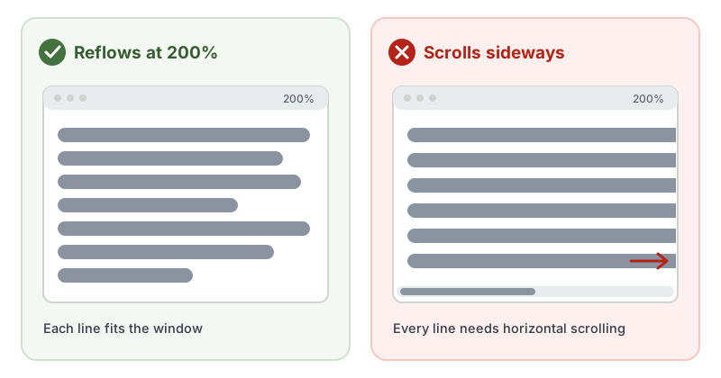
Use relative font sizes (rem or em), fluid layouts and wrapping text, rather than fixed pixel widths. Then zoom your browser to 200% at full-screen width and read a few paragraphs. If you have to scroll sideways to finish a line, the layout needs work.
How to Test for 1.4.8 Visual Presentation
Parts of 1.4.8 can be measured in code, but judging it needs a person looking at real pages. Check each long block of text:
- Width: count the characters on a typical full line, or check the CSS
max-width. It should be 80 or fewer. - Alignment: look for
text-align: justifyin your CSS. - Spacing: check
line-heightis at least 1.5 and that paragraphs have extra space between them. - Resize: zoom to 200% in a full-screen window and confirm you never scroll sideways to read a line.
- Colors: turn on a high-contrast or reading mode, or apply a custom style, and confirm the text still takes the new colors.
Use our free WCAG color contrast checker to confirm any colors you do set stay readable, and see our 1.4.8 Visual Presentation page in the WCAG library for a quick reference.
Related Success Criteria
- 1.4.3 Contrast (Minimum): text must have enough contrast with its background.
- 1.4.4 Resize Text: text can be resized to 200% without loss of content.
- 1.4.10 Reflow: content fits a narrow window without two-way scrolling.
- 1.4.12 Text Spacing: layouts must survive people increasing spacing themselves.
Want to see which readability and contrast issues software can catch on your pages? Run a free WCAG scan.
Frequently Asked Questions
What level is WCAG 1.4.8 Visual Presentation?
Level AAA. It has been part of WCAG since version 2.0. Most laws ask for Level AA, so 1.4.8 Visual Presentation is rarely required, but its rules are simple typography choices that make long text easier for everyone to read.
Does 1.4.8 Visual Presentation apply to every piece of text?
It applies to blocks of text, meaning more than one sentence of running text such as paragraphs in an article. Buttons, labels, headings and short snippets are not blocks of text.
Do I need to build a color picker to meet 1.4.8?
Not necessarily. The criterion asks that a mechanism is available. If your page does not block the colors people set in their browser or operating system, that setting can be the mechanism. A theme or color switcher on the page is another way to meet it.
How is 1.4.8 different from 1.4.12 Text Spacing?
1.4.12 Text Spacing (Level AA) says your layout must not break when people increase spacing themselves. 1.4.8 Visual Presentation (Level AAA) asks for comfortable spacing, width and alignment to be available in the first place.
How we reviewed this article
- Current version
First published. Checked against the W3C WCAG 2.2 Recommendation and the Understanding document for 1.4.8 Visual Presentation.