WCAG 3.3.2 Labels or Instructions Explained in Plain English
WCAG 3.3.2 Labels or Instructions explained simply: visible labels, format hints, grouped fields and required markers, with code examples and a test routine.
Table of contents
3.3.2 Labels or Instructions is the WCAG success criterion that makes sure people know what to enter in a form. Every field needs a clear label, and where the answer has to follow a format or a rule, people need to be told before they start. This guide explains WCAG 3.3.2 Labels or Instructions in plain English: what a good label looks like, when to add instructions, code examples and how to test your forms.
The official wording: “Labels or instructions are provided when content requires user input.” (W3C, WCAG 2.2)
What Is 3.3.2 Labels or Instructions?
3.3.2 Labels or Instructions is a Level A requirement under the Understandable principle, in the guideline “Input Assistance”. It applies to any place people enter information: sign-up and checkout forms, search boxes, filters, surveys and settings.
It asks for two things:
- Labels: visible text that says what each field, checkbox, radio button or menu is for.
- Instructions: extra guidance where people need it, such as a required format (“DD/MM/YYYY”), a rule (“at least 8 characters”), or which fields are required.
The goal is to prevent mistakes before they happen. Error messages after the fact are covered by 3.3.1 Error Identification and 3.3.3 Error Suggestion.
Why 3.3.2 Labels or Instructions Matters
A form without clear labels and instructions turns into a guessing game:
- People with cognitive or learning disabilities may not work out what an unlabelled field wants, or may forget a hint that has disappeared.
- People with memory impairments lose track of what a field is for once placeholder text vanishes.
- Screen magnifier users see only part of the screen, so a label placed far from its field may be out of view.
- Screen reader users rely on labels to know what each field is. Without instructions, they only discover format rules through error messages.
- Everyone makes fewer mistakes, and finishes faster, when a form is clear.
Who Is Affected by 3.3.2 Labels or Instructions
- People with cognitive, learning or memory disabilities
- People who are blind or have low vision
- People who use screen magnifiers
- People filling in a form in a second language
- Older adults and anyone new to a form or service
How to Meet 3.3.2 Labels or Instructions
Give every field a visible label
Every input needs a label people can see, that stays visible while they type. The W3C technique G131, providing descriptive labels, covers the wording: short and specific, such as “Email” or “Postcode”, not “Field 1” or “Details”.
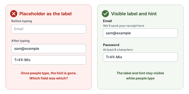
Connect the label to its field in the code with the label element, as in the W3C technique H44, using label elements to associate text labels with form controls. Put hints in text next to the field and connect them with aria-describedby, so screen readers read them too:
<label for="email">Email</label>
<p id="email-hint" class="hint">We'll send your receipt here</p>
<input id="email" name="email" type="email" autocomplete="email" aria-describedby="email-hint">
Do not rely on placeholder as the label. If you use it, use it only for an example, and keep the real label and instructions visible.
Explain formats and rules up front
If an answer must follow a format, say so before people type. The W3C technique G89, providing expected data format and example, describes this:
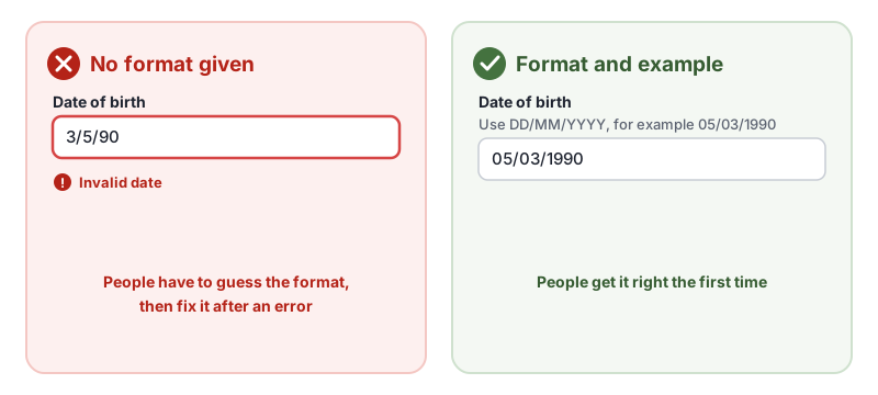
<label for="dob">Date of birth</label>
<p id="dob-hint" class="hint">Use DD/MM/YYYY, for example 05/03/1990</p>
<input id="dob" name="dob" inputmode="numeric" autocomplete="bday" aria-describedby="dob-hint">
Do the same for password rules, file size limits, character limits and anything else that could cause an error. For long forms, a short note at the top that explains what people will need helps too, as in the W3C technique G184, text instructions at the start of a form.
Mark required and optional fields in text
Tell people which fields they must fill in, in words. Either mark each required field “(required)”, or say at the top “All fields are required unless marked optional” and mark the optional ones. An asterisk works if you explain what it means at the start of the form. Do not use color alone to show required fields, which also fails 1.4.1 Use of Color.
Label groups and every part of a group
Radio buttons, checkboxes and fields that belong together need a label for the group and a label for each part:
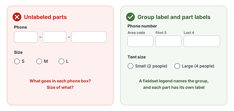
Use fieldset and legend for the group, as in the W3C technique H71, describing groups of form controls with fieldset and legend:
<fieldset>
  <legend>Tent size</legend>
  <input type="radio" id="size-small" name="size" value="small">
  <label for="size-small">Small (2 people)</label>
  <input type="radio" id="size-large" name="size" value="large">
  <label for="size-large">Large (4 people)</label>
</fieldset>
A phone number split into several boxes with no label on each part is failure F82, visually formatting phone number fields without a text label. A single phone field is usually simpler for everyone.
Keep labels close to their fields
Put each label right above or right beside its field, so the pairing is obvious. Labels far away from their fields, such as in a wide two-column layout, are easy to mismatch, and at high zoom the two may not be on screen together.
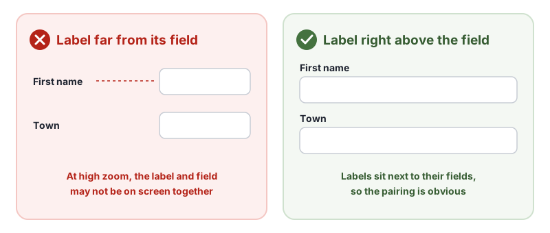
Checkbox and radio button labels usually go to the right of the control. A search field can be labelled by a clearly worded button next to it, such as “Search”, as in the W3C technique G167, using an adjacent button to label the purpose of a field.
How to Test for 3.3.2 Labels or Instructions
Automated checkers find fields that have no label in the code, but they cannot tell whether a label is visible, clear or close to its field. In our test of 10 accessibility checker tools, an email field labelled only by placeholder text was reported as an error by just 3 of the 10 tools, and AccessBell was not one of them. Test every form by hand:
- Look at each field. Does it have a visible label that says what to enter?
- Start typing. Is the label still visible once the field has text in it?
- Look for rules. Is every format, length limit and password rule explained before people type?
- Check required fields. Are they marked in text, not only with color?
- Check groups. Do radio buttons, checkboxes and split fields have a group label and a label for each part?
- Zoom to 200% or use a screen magnifier. Can you still see each label next to its field?
For a quick reference, see our 3.3.2 Labels or Instructions page in the WCAG library, and the W3C’s Understanding 3.3.2 Labels or Instructions.
Related Success Criteria
- 1.3.1 Info and Relationships: labels are connected to their fields in the code.
- 2.4.6 Headings and Labels: headings and labels describe their topic or purpose.
- 2.5.3 Label in Name: the visible label is part of the control’s accessible name.
- 3.3.8 Accessible Authentication (Minimum): sign-in forms work with password managers and paste.
Want to find form fields with no label in the code? Run a free WCAG scan of any page, then check your labels and instructions by hand.
Frequently Asked Questions
What level is WCAG 3.3.2 Labels or Instructions?
Level A, the most basic level. It has been part of WCAG since version 2.0, so it applies to every site that aims for WCAG 2.0, 2.1 or 2.2.
Is placeholder text enough to meet 3.3.2 Labels or Instructions?
We do not recommend it. Placeholder text disappears as soon as people start typing, is often low in contrast and is not reliably read by all assistive technology. Use a visible label, and put hints in text next to the field.
What is the difference between 3.3.2 and 1.3.1?
3.3.2 Labels or Instructions is about whether people can see labels and instructions when they fill in a form. 1.3.1 Info and Relationships is about whether those labels are connected to their fields in the code, for example with the label element, so assistive technology can announce them.
Can an automated checker test 3.3.2 Labels or Instructions?
Only partly. Checkers can find fields with no label in the code, but they cannot judge whether a label or instruction is clear enough. In our test of 10 accessibility checkers, only 3 reported an email field labelled only by placeholder text as an error.
How we reviewed this article
- Current version
First published. Checked against the W3C WCAG 2.2 Recommendation and the Understanding document for 3.3.2 Labels or Instructions.